Wednesday 27 October 2010

Lecture No.4 Reflective Visual Journal


The Reflective Visual Journal or RVJ for short, is going to be the most important part of the course, it will act as a HUB for my initial ideas, developing the ideas, analysing and criticizing my own work to develop it further. Since it's not digital, most of the input is going to be done by hand, meaning sketching up ideas, using different materials and processes and writing. Not to say you can't stick different media into the RVJ, photographs can be used as a source of inspiration or combined with traditional drawing. It's important to try and record our thought process clearly, so other people other than the one who is presenting the RVJ can understand, usually not everything in our heads will instantly communicate with others, so that's why it's important to lay things out not neatly but some what with style or sense.
I also learnt that while writing up ideas with words it's also a good idea to draw images at the same to get take the images from our mind in put them down on paper, doesn't have to be artistic can be as simplistic as you want, for then when it comes time to use the sketch or doodle you will have something to devel
op and to have a thinking process on how using that particular sketch will fit into an overall design.
The example above shows the person drawing the first thing that flows into their head while drawing up a map, and it made things easier to visualize the general area, though there is one thing missing, annotation but I think the person was more focused on using images more then words. Very simple and could be developed into something more with the miniature images he has drawn up, it also shows how the person see's things, from Road Signs to Logos, Graphical indeed.

Sunday 24 October 2010

Lecture No.3 Idea, Theory and Principles


The layout of the text is very important you may have the opportunity to place text anywhere you wish but while in doing so there are multiple obstructions that can get in the way of your text being legible are not. General Layout, having using paragraphs and not just full lines of words where the eyes become tired or the text doesn't flow as easily.
Colour is one, for example: having a yellow coloured font over a white background. The text almost blends in with the background and makes the text illegible, so the colour of the font and the colour of the area where the font will be placed is very important.
Font size is also important to keep in mind, more of an obvious note, if the font is too small then it becomes illegible, too big and it could potentially ruin the design. It does come down to what you are designing and what tone of voice your trying to emit. There are certain font size regulations to follow in some areas of the design industry,
examples: Newspapers, magazines.
Typeface can also effect legibility, there are many different types of typefaces out there and some are god awful, as designers we need to know when using a sans serif and a serif typeface would be a wise choice.
Type over images, having type overlapping images is not a wise choice, especially if the colour of the image itself is that of similar colour to that of the type that is over lapping it, they blend into each other and rendering them both useless.

Above is an example of how text could become hard toread if the layout of the words are not thought of properly.
I also learnt that within almost every design there should be a tone of voice, could either be the text or images or general colours of the design.
Text can easily express a tone of voice, trying to get a loud message across one would go about using Bold Capitals to express shouting, all typefaces have their own tone of voice and as designers we can manipulate the text to express a tone of voice. Colours can express tone of voice, example: sky blue has a very calm and soothing look and pink though not as feminine as it used to be still sends out a feminine feel and would be used for the boxes of girls dolls.
Imagery will always have different tones of voices, doesn't only come down to what the image is, it can also be how the image was portrayed, black and white for a more serious artistic look or at a awkward angle to express panic there are multiple of ways to express a tone of voice using imagery.
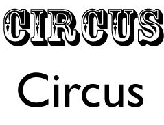
Above is a simple example of tone of voice in type.

Sunday 10 October 2010

Lecture No.2 Research Language


. Research, When I first started being creative I had almost no direction it's most like the same for everyone, some people are born with talent and some of us need to study up. Talented or not research is extremely important and I realise this clearly, once I started looking up different artists paths began opening up, the techniques the colours the forms, all boosted me into being inspired to go and try these different techniques. I understand there are two different forms of research one is Primary research where we need to go out in the world and have some initiative to look for our own form of research, simply reading a paragraph of text could easily inspire people to be creative, and to create illustrations based off of text and keep it's message is a complete success. The second form of research is Secondary research, where less initiative is needed especially now with the internet it's easy to search up on many different artists it's convenient and it could still inspire work but with less originality. For us to be visual communicators it's important to try and take something small and meaningless and change it into a piece of art/design with meaning.

Above is a scan in of some Primary research.
. Target audience, to have a piece of design is one thing but having it communicate a message is another. So as visual communicators it's very important to always be thinking about the target audience even if it's just a small minority of people with certain tastes it's important to know about the culture, who these people are and what do they do. We can't just take guesses we need to study up, we might not care for the life style but as visual communicators we need to capture their attention and have them understand that we understand who they are, so they can take the message seriously. Knowing the audience can change the design of any idea from colours to style of lines, it can go on.

Above is a flyer which was made for a rock concert, keeping things simple, with just a shot of a clothing with skulls and adding colours that make it seem as though the person as at the rock concert.


Lecture No.1 Connectivity


. From what I get from the point 'Notions of Originality' is that if you are going to be inspired by an older and already used concept, that it's not a terrible idea to use some of it's essence in some of our own work. It is important to not try and create an exact replica of someone else's idea since it will become unoriginal, but to add some of our own essence our own talent into it without shaming the previous isn't a bad thing. As long as we show where and by whom we were inspired by simply shows some form of sophistication.I don't mind taking something that is old and worn out and try to recreate it to bring it into a new more modern light, simply put history is history only those who delve into research will know of the previous artists and ideas and some people would think that you yourself have created something brand new in which you simply did not, but for those that do know where the idea came from to show them that some originality was put into it and that it's truly just a homage.

The I popular ipod ads were slightly inspired by Matisse, the colours and the black silhouette. One can hardly say that ipod ripped it off because they added in their own messege and their own style.

. We live in modern day times with modern day minds, and us visual communicators need to send clear messages to these people. To use a context within an old historical piece and bring it to more modern day issues is I think perfectly fine because context is simply just a message.
Also I think that it's fine to take the message and twist it around to communicate to a certain audience. It comes down to the target audience, as in who is going to understand the reference and realise what the new context relays, could be upsetting, humorous...to take something serious and change it into something humorous could offend others but as long as there is a strong reason for it then I think it's fair game, but if it's on the same ground as a childish prank with no message and doesn't connect with any audience then simply it's a failure.